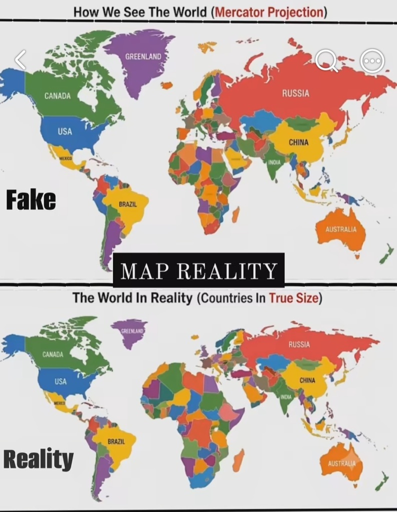
The image illustrates one of the biggest drawbacks of the Mercator projection (the most common type of map we see, for example, on Google Maps). This projection distorts the size of landmasses, making areas near the poles appear much larger than they actually are compared to...See more