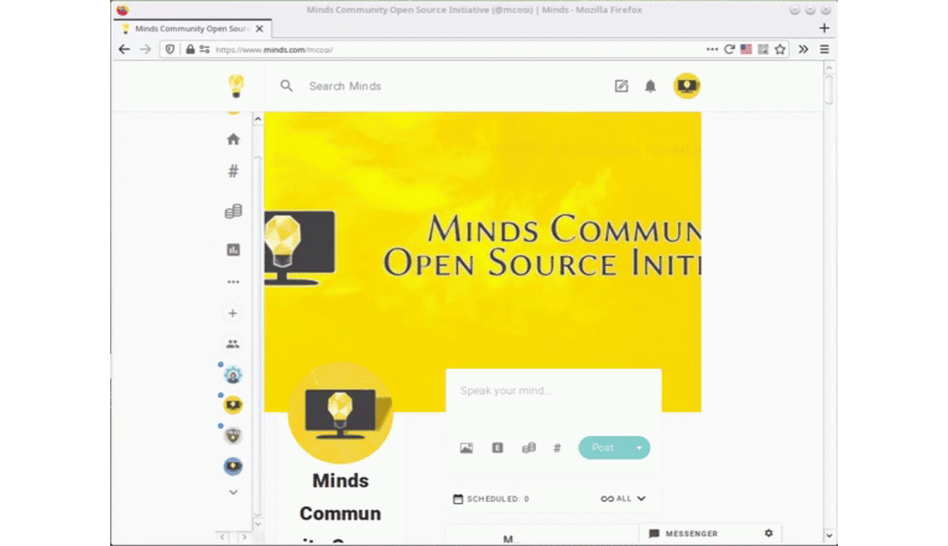
Minds New Interface
As someone that has extensive experience within the Information Technology (IT) industry (with over 25 years worth of IT related experience in areas of providing end-user support within various scenarios, network and infrastructure administration, project management experience, web site / web services development and deployment experience, as well as having experience within several other aspects of the IT industry), a founding member of the Minds Community Open Source Initiative (MCOSI) and a volunteer that provides community support (I review and if necessary, provide replies to enquires within both the official Help and Support group, the Minds User Group and the MCOSI group, as well as submitting reports to and providing information within Minds Gitlab project management / bug ticketing facility), I was asked by a senior staff member to review the new user interface / user experience (UI / UX) upgrades that are being rolled out across Minds within the near future.
During the course of the review I examined all aspects of the UI / UX changes that (at the time of publishing this blog article) can be explored by opting into the experimental Canary facility. I have had discussions with individual members of the senior staff and with other members of the MCOSI in relation to the UI / UX changes. I have also fully reviewed the Canaries group (this group has been provided by the Minds staff so that community members can share their thoughts and opinions regarding the features that are provided via the Canary facility, as well as giving community members the opportunity to report any issues with any of the experimental and upcoming features).
While overall, the changes provide a clean, intuitive and pleasant experience to the web browser interface with many improvements being added, there are several minor issues and one fairly major problem which exist within the new interface.
Minor Issues
During the review I found a couple minor issues which with further development, should be easily resolvable.
1. There is an issue with uploaded media files (video and image content) being displayed above the body text content within posts, whereas thumbnails which are provided by external sites and video content platforms are displayed under the body text content. For the purpose of consistency and ease of access, it would be sensible to display all media (both uploaded media files and external media) under the body text.
2. If the group conversation (live chat) side-bar has been collapsed (by clicking on the conversation > button) or disabled by a group administrator then the group profile element is displayed a couple pixels to the right and therefore, becomes out of alignment to the rest of the group elements.
when the group conversation side-bar is collapsed or is disabled
3. When clicking the analytics option within the left menu side-bar, the analytics sub-menu (the menu which displays the traffic, engagement, earnings and trending options) doesn’t appear and only appears when the mouse point is not over the section.
4. There are a couple issues regarding the license agreement options which are displayed within the compose modal dialog box.
These issues includes the following:
a. The initial characters of the second and third words within the “All rights reserved” option are displayed as lower case. Considering that all other options have there initial characters displayed as upper case, for the purpose of consistency, the “All rights reserved” option should be display as “All Rights Reserved”.
b. The “Public Domain CCO” license option contains a single quote at the begin of the phrase “No Rights Reserved” but lacks a quote at the end of the phrase. Also, the term “CCO” should be displayed with a zero instead of the letter “O”.
c. The “Attribution-ShareAlike” option includes the “BY-SA” abbreviations (which for the purpose of consistency, should be displayed as “CC BY-SA”), the “Attribution-NoDerivs” option includes the “CC BY-ND” abbreviations and the “Attribution-NonCommercial” option includes the “CC BY-NC” abbreviations, whereas the “Attribution-NonCommercial-ShareAlike”, “Attribution-NonCommercial-NoDerivs” and “Creative Commons Attribution” option do not include any abbreviations (also, the term “Creative Commons” should precede all of these options. This means that the menu width needs to be increased to fit all statements).
d. The term “no rights reserved” is not legally recognised by any country and has not been since the dissolution of the previously internationally recognised Buenos Aires Convention (which the United States of America opted out of in 1989. Nicaragua was the last country to opt out of the Buenos Aires Convention and opted out of this convention in 2000. Countries decided to comply with the Berne Convention for the Protection of Literary and Artistic Works instead of the Buenos Aires Convention. The Berne Convention does not formally recognise the “all rights reserved” terminology and therefore, all signatory countries also no longer formally recognise said terminology).
5. Depending on screen resolution, browser zoom level and the dimensions of the browser window, menu tooltips maybe shown beyond the browser window area and therefore, menu tooltips may not be fully displayed (this is especially true when hovering the mouse pointer over group avatar icons). This issue is related to the following major issue.
(note the black tooltip which is being cut off due to browser dimensions)
Major Issue
As stated at the beginning of this blog article, the new browser interface provides a pleasant experience. However, depending on screen resolution size, browser zoom level and browser window dimensions, the experience can be fairly daunting. This is due to how the width of the columns are calculated and may result in a less then optimal usage scenario. As an example, on a 1024 x 768 screen resolution (with the browser window fully maximised to cover the entire desktop area and the browser zoom level set to 100%), the interface can feel cramped with very limited space being provided to the middle (content) column.
The three column based layout also produces even more dead space when the right column is not utilised (such as within groups that have the conversation side-bar disabled by the group administrators). Also, depending on browser or screen dimensions, group, blog article and channel banners may not have have their aspect ratio displayed in proportion to the rest of the interface and the group conversation side-bar may not be displayed.
Note that I consider a screen resolution measuring 1024 x 768 pixels to be the sensible minimum display standard for desktop computer workstation and laptop usage. Mobile phone and tablets may have smaller screen resolutions and therefore, browser based viewing of the Minds platform while using these devices may produce varying results.
 1024 x 768 screen resolution display of a channel
 (browser zoom level set at the default 100% setting)
References & Other Resources:
* Canary Facility
* Canaries Group
* Minds Official Help & Support Group
* Minds Community Open Source Initiative Group
* Minds User Group
* Further Review Of Minds New Interface
* Technology & Open Source Blog