Further Review Of Minds New Interface
Within my last blog article (Minds New Interface), I examined the recently implemented browser based user interface / user experience (UI / UX) upgrade and identified several issues. It has been two weeks (at the time of publishing this article) since I published the Minds New Interface blog article and have had the opportunity to review comments which community members have subsequently posted to both the official Help and Support group, the community provided Minds User Group, the Canaries group and to the Minds New Interface blog article.
This latest review has given me the opportunity to further examine several issues and identify recently discovered problems that are affecting community members experience of using the new UI / UX changes.
Browser Zoom Level, Browser Dimensions & Screen Resolution
In my last article I explored an issue which causes the column based layout to become fairly cramped and can result in producing dead space within the outer columns (this is dependent on screen resolution, browser window dimensions and browser zoom level). I examined this issue from the perspective of using relatively small screen resolutions. Since the publication of the Minds New Interface blog article, I have read several reports that community members have provided, which examined this issue from the perspective of using large screen sizes and varying screen resolutions. As an example, I have seen several comments in which community members are needing to use their browser zoom facilities to be able to comfortably view Minds while using screens sizes of 22 inches and above. Based on what I have read, it seems that in several cases, community members have had to set their browser zoom levels to between 130% and 200%. I have also read comment in which community members that have visual impairments having difficulties due to this issue and therefore, I have to consider the screen resolution / browser windows dimension / browser zoom level issue as being an accessibility problem.
Depending on the browser zoom level, this issue can cause the mouse area hit box within Messenger to become out of alignment and therefore, depending on where the mouse pointer is positioned, when clicking on both the Messenger text input box and on the Messenger title bar (to expand the Messenger dialog box), the expected functionality fails to work correctly.
I have also seen reports that provides examples of the buttons which are displayed at the bottom of the compose modal dialog box being either partially or fully hidden due to browser zoom level, browser window dimensions and screen resolutions. This issue is also affecting the text formatting bar that is provided within the Blog facility, as well as the banners that are displayed within blog articles (hopefully the text formatting bar and the banner issues will be resolved when the upcoming new version of the Blog facility becomes fully implemented).
 Messenger hit box issue
 (related to browser zoom level, browser dimensions and screen resolution issue)
Increased Processor Loads
While scrolling through the various feed sections (ie. channels, Newsfeed, Discovery and groups), CPU spikes (increased processor loads) can occur when encountering page creases (ie. when the next group of posts are being rendered). Depending on how many page creases have been scrolled through and posts content, the CPU load can stall the browser during the rendering process and can cause browsers to display warnings (this is especially an issue for Mozilla Firefox and Firefox derivative browsers but on several occasions, I have seen this issue when using Blink / Chromium and Webkit based browsers).
The stalling issue seems to be affecting groups more then it is affecting channels, the Newsfeed and Discovery.
 Mozilla Firefox stalling when scrolling through feeds
Minor Issues & Inconsistencies
I examined a minor issue in my previous blog article which causes groups profile element to be displayed a couple pixels to the right of the subsequent posts when the group conversation side-bar has been either disabled by a group administrator or collapsed (by clicking on the conversation > button). Since then I have discovered another minor issue which causes groups that have already had their conversation side-bar disabled to display the area which would contain the side-bar and results in producing further dead space on the right side of these groups.
 Issue with groups displaying further dead space when the conversation side-bar is disabled
There is also an issue which prevents the hashtag and username auto-suggestion pop-up functions to be displayed when typing said elements within the comments section while using Mozilla Firefox and Firefox derivative browsers. A similar issue is happening when trying to type usernames and hashtags directly into the compose dialog box while using any browsers.
If a post has been scheduled for publication at a later time, while waiting for the schedule to be met, the post will be shown to the original publisher as being posted 0 seconds ago and does not display the intended publish time stamp.
Also, the old wallet section included information which showed the point value of corresponding contribution actions (ie. a vote equates to 1 point, comments equates to 2 points, subscribers equates to 4 points etc.) but the current wallet section lacks this information.
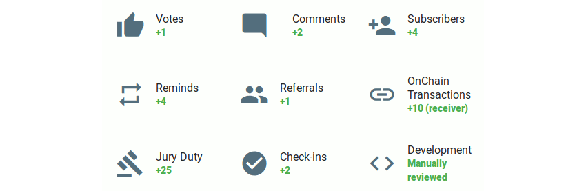 Contribution points value information as displayed within the old wallet (contributions) section
There are a couple inconsistencies within the formatting of posts. Firstly, some posts have their body (content) text displayed at a font size of 15px, while other posts body text display a font size of 28px. Secondly, uploaded media (images and video files) are displayed above the post body text, whereas media files and thumbnails that have been provided by external web sites, as well as thumbnails that have been provided by other posts and blog articles are displayed beneath the posts body text.
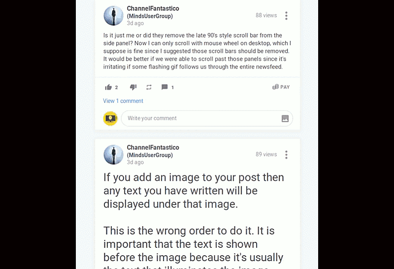 Posts displaying two different font sizes and uploaded media files being displayed above
 post body (content) text, while external (third party) media content and thumbnails are
displayed beneath posts body text
When editing comments which contains the lesser than (<) and / or the greater than (>) characters, these characters are converted to their HTML entities (ie. < and > respectively). However, when the edited post are submitted (posted), these HTML entities are converted back to their respective characters.
Another issue that I have discovered is that while viewing my own channel, if I submit a new post then the channel does not automatically display the new post and I have needed to either refresh the browser tab / window or leave and return to the channel before I can see the inclusion of the new post.
There are also some issues within the top bar. The first of these are related to the “Easter egg” that is associated with the Minds logo. Several community members (especially new members) are finding the dark / light mode toggle that happens when the mouse pointer hovers over the Minds logo to be disconcerting.
The second issue is related to the tool tip that is displayed when hovering over the “speak your mind” (compose) button, which (depending on community member’s operating system / desktop environment configuration) is displayed over two lines. While examining Minds Gitlab project management and bug tracking facility, I found an image that was submitted by a senior staff member which showed the “speak your mind” tool tip being displayed on a single line. The “speak your mind” icon also occasionally disappears from the top bar.
There is also a question about the suitability of the “speak your mind” icon when compared to the overall design language (styling) that is being used within the rest of the Minds interface (especially when compared to the notifications icon).
Also, the tool tip that is displayed when hovering over the notifications (bell) icon uses the community member’s operating system / desktop environment native styling, whereas all other tooltips uses Minds styling (black background with white text).
 Speak your mind tool tip displayed over two lines and notifications tool tip
 being displayed using native desktop environment styling
Over the course of the several weeks, I have reviewed many comments and posts that have been submitted to both my last article, the official Help & Support group, the official Canaries group and the community supported Minds User Group. I would like to thank all community members that have provided posts and comments which are related to their experience of using the new user interface. I also want to especially mention ChannelFantastico, RodFather, Luculent and CSharpner. All the information that community members have submitted has aided me in providing this blog article.
References & Other Resources:
* Minds New Interface (Previous Blog Article)
* Canaries Group
* Minds Official Help & Support Group
* Minds Community Open Source Initiative Group
* Minds User Group
* Minds Gitlab Project Management & Bug Tracking Facility
* Technology & Open Source Blog